Brand identity design
A visual identity that looks consistent everywhere your brand shows up, from your website to your business card.
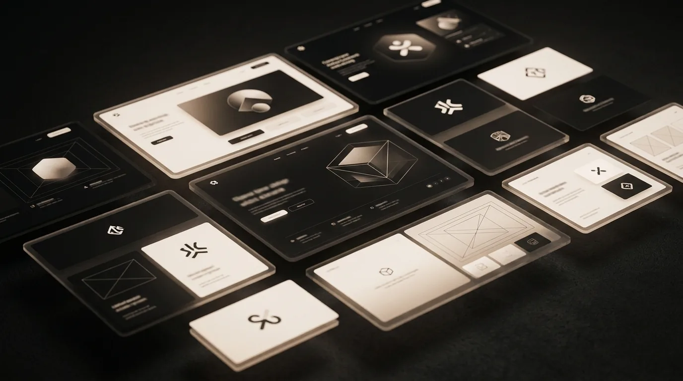
A concept identity system built to show how BMG approaches logo, color, and type as one connected system rather than separate pieces.
This is a concept study, not a real client engagement. It was built to demonstrate how BMG structures a brand identity project from a blank page to a documented system.
A fictional Hong Kong wellness studio needed an identity that felt calm and premium without slipping into generic minimalism. The brief called for a system flexible enough to cover signage, digital, and print.
We explored a restrained palette built around warm white and soft black, with a single accent tone reserved for moments that need attention. Type pairing favored a clean sans serif for structure and a slightly warmer weight for supporting text.
Primary and secondary marks shown at multiple sizes with minimum clear space rules.
The full palette and type scale documented with usage ratios and pairing rules.
The identity applied across a business card, a signage concept, and a social template.
As a concept study, this project has no real business metrics to report. What it demonstrates is a repeatable process for turning a brief into a documented, flexible identity system.
The exercise moved from an open brief to a constrained, three tone system with clear usage rules, showing how early flexibility narrows into a confident final direction.
A visual identity that looks consistent everywhere your brand shows up, from your website to your business card.
Most brand identity problems come from a handful of missing basics. This checklist covers the essentials in the order they usually matter.
Learn how BMG approaches every project, from discovery through to launch.
A concept website build showing how BMG structures a site around clear visitor decisions instead of decoration.
This was a concept study. Tell us about your real project and we will show you how the same thinking applies.